What Is Responsive Web Design?
Responsive websites can use flexible grid layouts that are based on the percentage each element takes up in its container. For instance, if a single element is 30 percent, it will always be 30 percent regardless of the size of the screen used by the device that is accessing the site.
As a result, you get a uniformly excellent experience no matter how big the screen is on your device. Also, there are a ton of responsive website templates out there you can use.
The drawbacks? If you’re starting at the beginning, you’ll need to test your site extensively. And if you don’t know how to code, custom responsive website designs can be pretty difficult to build.
People spend, on average, 3.3 hours a day engaging with digital media on their smartphones. Because of this shift in consumer behavior, it’s no longer enough to have a website that only works from a desktop computer.
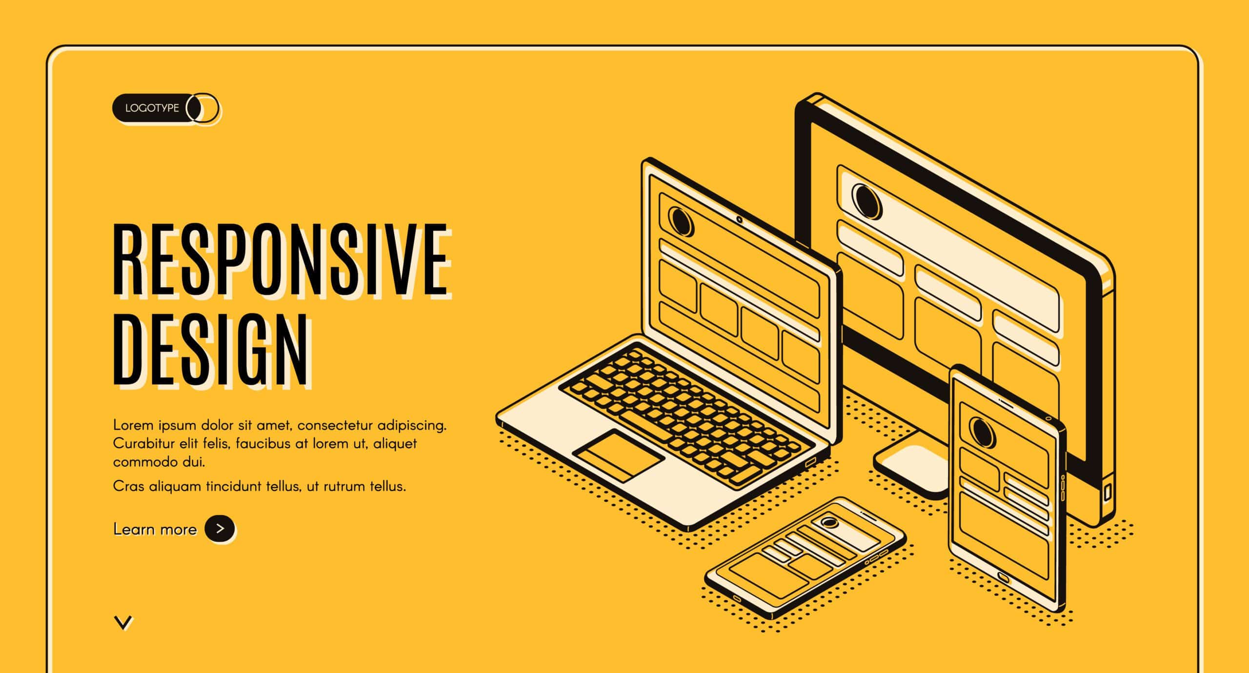
What is a responsive website design? A responsive web design automatically adjusts for different-sized screens and viewports. With a responsive website, someone can browse your website from any device and it will still look and function perfectly.
How Responsive Websites Work
A typical website is comprised of a set of files (each web page—home page, about page, etc.—is an individual file). Each file contains HTML code and content (text and images). Web pages are styled with files called Cascading Style Sheets (CSS). For ease of explanation, let’s say that a standard (non-responsive) website has a set of files and a few CSS files that govern the look of the site. A responsive website applies an alternate set of CSS files depending on the device being used to access the site. The site looks and ‘responds’ differently based on the device.
“Mobile first” is the saying in the digital industry that’s been guiding online companies to tailor their websites to fit the smaller screens of smartphones. The emphasis on mobile browsing began years ago, but the methods rapidly adapt to new consumer usability standards and user-friendliness. In the past, businesses typically created entirely different websites with unique URLs for their mobile websites. This method made it difficult for them to track conversions, as it resulted in two websites that required upkeep, maintenance, and tracking. Today, the standards come down to responsive or adaptive web design. Explore how responsive web design works.
How the CSS Works with Responsive Web Design
Responsive web design is fluid, while adaptive is more pixel-based. The CSS, or cascading style sheet, is where web developers implement responsive web design. Setting up a website with responsive web design means the website will automatically adjust everything on the web page using a percentage-based outline. For example, if you want a specific column on a page to take up 50 percent of the screen, then the column will take up 50 percent of the space regardless of the screen size. This keeps the design consistent and user focused.
With responsive web design, the exact same content doesn’t always appear on small screens and large screens—mobile devices often can’t handle all the extra fluff or content that looks clean on a laptop or desktop computer. Use the CSS to choose what to show and what to omit on your mobile site.
Why Responsive Web Design Is Important
There was a time when people only accessed websites from a desktop computer. The vast majority had the same size monitor. Websites were designed for the average visitor. Today, people access websites from a variety of different devices with screens ranging from a few inches all the way up to 27″ or more and expectations have changed. Consumers expect the website they’re visiting to know that they’re using a tablet vs. a PC. They expect the site to adjust to them—not the other way around.
SEO Implications
Google is making changes to make the Core Web Vitals more impactful on website rankings than ever before. This will now emphasize user-friendliness in loading, interactivity, and visual stability. Google is now recommending switching to a responsive web design model to keep up with changing expectations.
Responsive web design makes the user experience more enjoyable and seamless. It removes the cumbersome pinching and readjusting of the screen for users. This may seem like a minor inconvenience, but the standard of what users expect is rapidly changing. Users want the most seamless and user-oriented experience possible, and responsive web design achieves this.

In the early days of web design, pages were built to target a particular screen size. If the user had a larger or smaller screen than the designer expected, results ranged from unwanted scrollbars to overly long line lengths, and poor use of space. As more diverse screen sizes became available, the concept of responsive web design (RWD) appeared, a set of practices that allows web pages to alter their layout and appearance to suit different screen widths, resolutions, etc. It is an idea that changed the way we design for a multi-device web, and in this article, we’ll help you understand the main techniques you need to know to master it.